Test your app's iPad layout and landscape, not only the phone
Apps built and tested on an iPhone break on an iPad or turned sideways. Run the same test on a tablet and in landscape, and check the layout-specific parts.
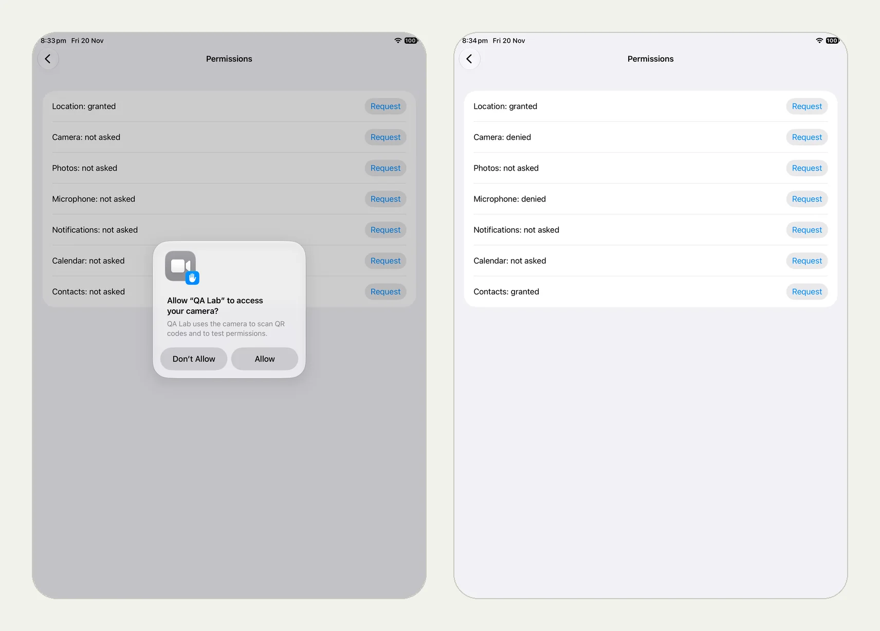
The device nobody on the team uses#
Teams build on phones. iPads and Android tablets get a glance before release, if that. Yet tablets change a lot: split views, popovers instead of sheets, two columns, keyboards that cover different parts of the screen, and Android tablets that start on their side.
Same test, another device#
A Testsy app test is saved with its device and OS version, and any run can use another one without changing the test. From the app docs:
- In the app: the Runs on line next to the app: iPhone or iPad, Android phone or tablet, the OS version and the orientation at the start.
- From CI or an agent:
device: tablet,osVersion,orientationon the run (--device tableton the command line).
Each result says what it ran on, for example "iPad · iOS 26".
A real run on an iPad#
We ran our permission prompt test on an iPhone, then on an iPad without changing a word. The picture at the top of this page is the iPad run: the prompts sit in the middle of a much larger screen and the test text is the same. It passed in 2 minutes 31 seconds (the run, live until 18 February 2027). The Android 10 tablet in the same post ran on its side, which is how Android tablets start.
Orientation#
By default a run starts the device its own way: phones and iPads upright, Android tablets on their side. Choose Portrait or Landscape to start turned, and a test can also rotate during the run in its own words:
Open the Orders tab and check the list shows at least one order.
Rotate the device to landscape.
Check the list and the order detail are shown side by side, and the
selected order is still selected.
Rotate back to portrait and check the order detail is still open.
Rotation tests have their own write-up with runs: Test rotation, dark mode and large text.
What to check on a tablet#
- Popovers. A share sheet on iPad is a popover, not a sheet. In our own practice app it shows as a popover 7 points wide on older iPads, a bug our engine runs keep finding.
- Split layouts. A two-column screen where selecting an item does nothing in the second column.
- Keyboards covering the field being typed into, in landscape.
- Images stretched or pixelated at tablet size.
Run it every release#
Put the tablet and landscape runs on every release build, from CI with --device tablet. They cost the same as a phone run: one run each.
This post is part of Mobile release testing: a guide for app teams.
Filed underiPhone and iPadAndroidDevices and versions