Test a site at phone, tablet and desktop sizes
Most visitors arrive on a phone, and most QA happens on a laptop. Run the same plain-language test at 412 × 914, 820 × 1180 and 1280 × 800 and compare.
Built on a laptop, used on a phone#
Designers and developers check a site on the screen in front of them. Visitors arrive on phones. Launch checklists know this: BugHerd's asks teams to check priority pages across phone, tablet and desktop views, with attention to navigation, forms, sticky elements and pop-ups. One developer's handoff list adds that forms need checking on iOS Safari specifically, and that there should be no horizontal scroll on mobile.
One test, three screens#
A Testsy website test has a Screen option, from the test options:
| Screen | Size |
|---|---|
| desktop | 1280 × 800 (default) |
| tablet | 820 × 1180 |
| mobile | 412 × 914 |
The test text stays the same. Duplicate the test and set each copy's screen, or set it when creating the test (device: "mobile" over the API). Every run says which screen it used.
A run on a phone-sized screen#
We ran a form test from our practice site on the mobile screen:
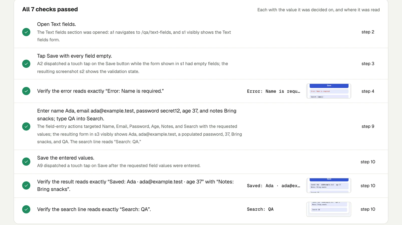
Open Text fields. Tap Save with every field empty and verify the error
reads Error: Name is required. Then enter the name Ada, the email
ada@example.test, the password secret12, the age 37 and the notes Bring
snacks, type QA into Search, and save. Verify the result reads Saved:
Ada · ada@example.test · age 37 with Notes: Bring snacks, and that the
search line reads Search: QA.
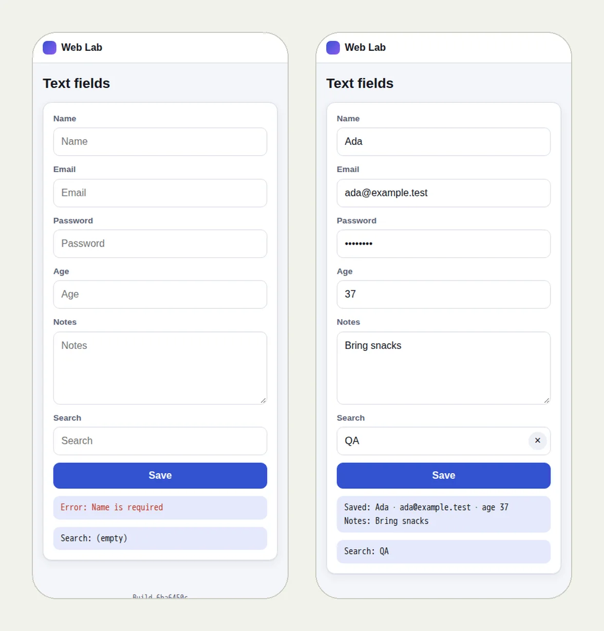
The picture at the top of this page shows two screens from the run, at 412 × 914: the error after an empty save, and the saved result. All 7 checks passed in 1 minute 2 seconds, in Chrome on mobile.
Open the run; it stays live until 18 February 2027.
What differs at phone size#
- Menus. The navigation becomes a menu button. "Open Services from the menu" covers both layouts.
- Fixed elements. A cookie banner or chat bubble can cover the Send button.
- Widgets with a fixed height, such as booking embeds, cut off their own buttons.
- Inputs. Date and number fields behave differently on touch screens.
What this is, and what it is not#
The mobile and tablet screens are Chrome at those sizes, with touch. They catch layout and interaction problems at that size. They are not Safari on an iPhone: rendering differences specific to Safari need a check in Safari. For a native iPhone or Android app, Testsy runs the app itself on iPhone, iPad and Android: see testing apps.
This post is part of Find the bug before your client does.
Filed underWebDevices and versionsForms and checkoutClient sites