Test the phone menu on a client site after every update
The hamburger menu is the navigation for most visitors, and it breaks after theme and plugin updates without anyone noticing on desktop. A phone-size test opens it.
The menu nobody checks on desktop#
On a phone, the menu button is the whole site's navigation. If it stops opening, visitors see the home page and nothing else, and the site's owner, checking from a laptop, sees nothing wrong.
It breaks more often than it should, and usually after an update nobody connected to it:
- A WordPress site owner's provider ran an automatic update overnight, and the burger menu does not open anymore on mobile devices, while desktop worked fine.
- Shopify store owners found that after updating the Dawn theme the hamburger menu fails to open on phones.
- On another site the menu expands and instantly closes on iOS, without any change by the owner.
- A WoodMart theme update left the menu not working after the main page loads until the visitor refreshed.
- On one site the menu button was there but nothing happens when tapped; a slider plugin was the cause.
Every one of these is invisible at desktop width. The usual way an agency finds out is the client's message.
The test#
Run it at phone size (412 × 914 in the test's Screen option, see sizes) and tap what a visitor taps:
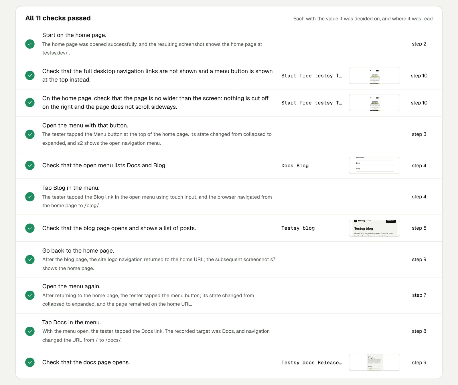
On the home page, check the full desktop navigation links are not
shown and a menu button is shown at the top instead. Open the menu
with that button and check it lists Docs and Blog. Tap Blog and
check the blog page opens and shows a list of posts. Go back to the
home page, open the menu again, tap Docs and check the docs page
opens. On the home page, check the page is no wider than the screen:
nothing is cut off on the right and the page does not scroll
sideways.
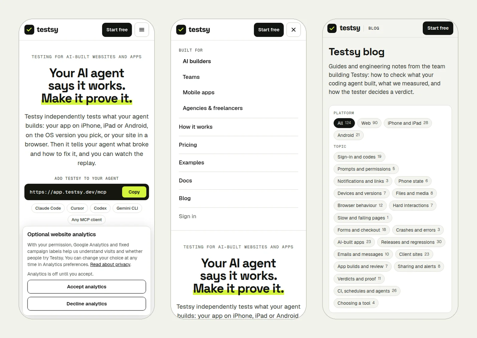
We ran it on our own site, testsy.dev, at phone size. The picture at the top of this page shows the run: the home page with its menu button, the menu open with Docs and Blog, and the blog page it led to. All 11 checks passed in 2 minutes 17 seconds.
Open the run (live until 18 February 2027).
Make it catch the bugs above#
- Open the menu twice. Several of the forum cases worked on the first page load and not after navigating. "Go back, open the menu again" is in the test for that reason.
- Tap a link and check where it lands. A menu that opens but whose links are covered by an invisible layer is still broken.
- Check the page width. A page that scrolls sideways on a phone usually means one element is too wide, often after a content edit.
- Run it after every update, and nightly on a schedule for sites that update themselves: Check forms after every WordPress plugin update has the routine.
What it does not cover#
Runs use Chrome at phone size. Some of the cases above happened only in Safari on iPhone, which this test does not run. It catches the menu that is broken everywhere, which is most of them, and the layout problems that show at phone width in any browser.
This post is part of Find the bug before your client does.
Filed underWebDevices and versionsReleases and regressionsClient sites